
The koncep of this logo is "rotation".
circle has eternal meaning, rotation, etc.
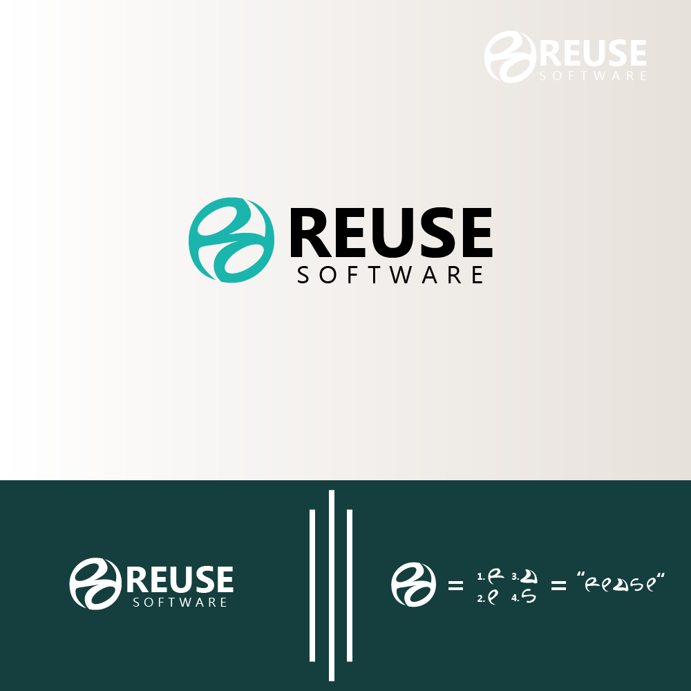
Logo is very unique because the translation of letters from the word REUSE is in this logo.
1. in the circle can be seen there are 2 letters "R" is the initial of the word "REUSE", top and bottom which when on the back will look the same, this also means "eternal / rotation".
2. and which connects the two letters "R" is the letter "S" which is also a component of the word "REUSE".
3. There is also the letter "E" lowercase, on the left and "E" upside down on the right side of the logo. the letter "E" is also a component of the word "REUSE".
4. There is also the letter "U" on the top right of the logo. The letter "U" is also a component of the word "REUSE".
The logo is made simple like a circle to give a modern impression.
using bold fonts on the word "REUSE" adds a masculine impression to the logo.