Packaging for luxurious coffee label

1
Creati su 99designs di Vista
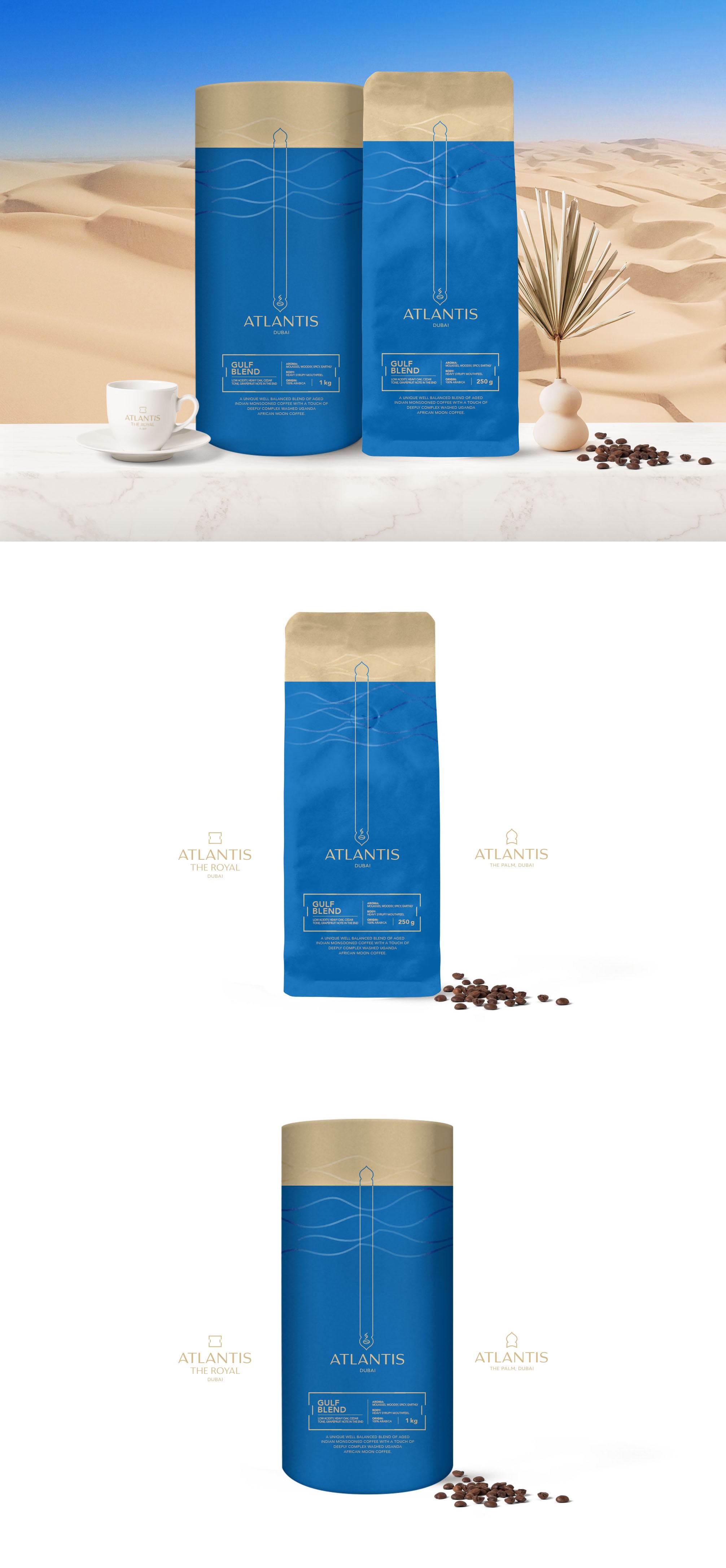
The design compliments the two logos, so it should fit in the surrounding of both hotels. The beige/golden top is a relative to the desert sands and the bright blue to the depth of the ocean where Atlantis lies.
Waves of a shiny vanish highlights the blue and beige areas to make them more organic, give them a more sandy/ocean-like touch and goes side by side with the organic forms in the hotel/rooms.