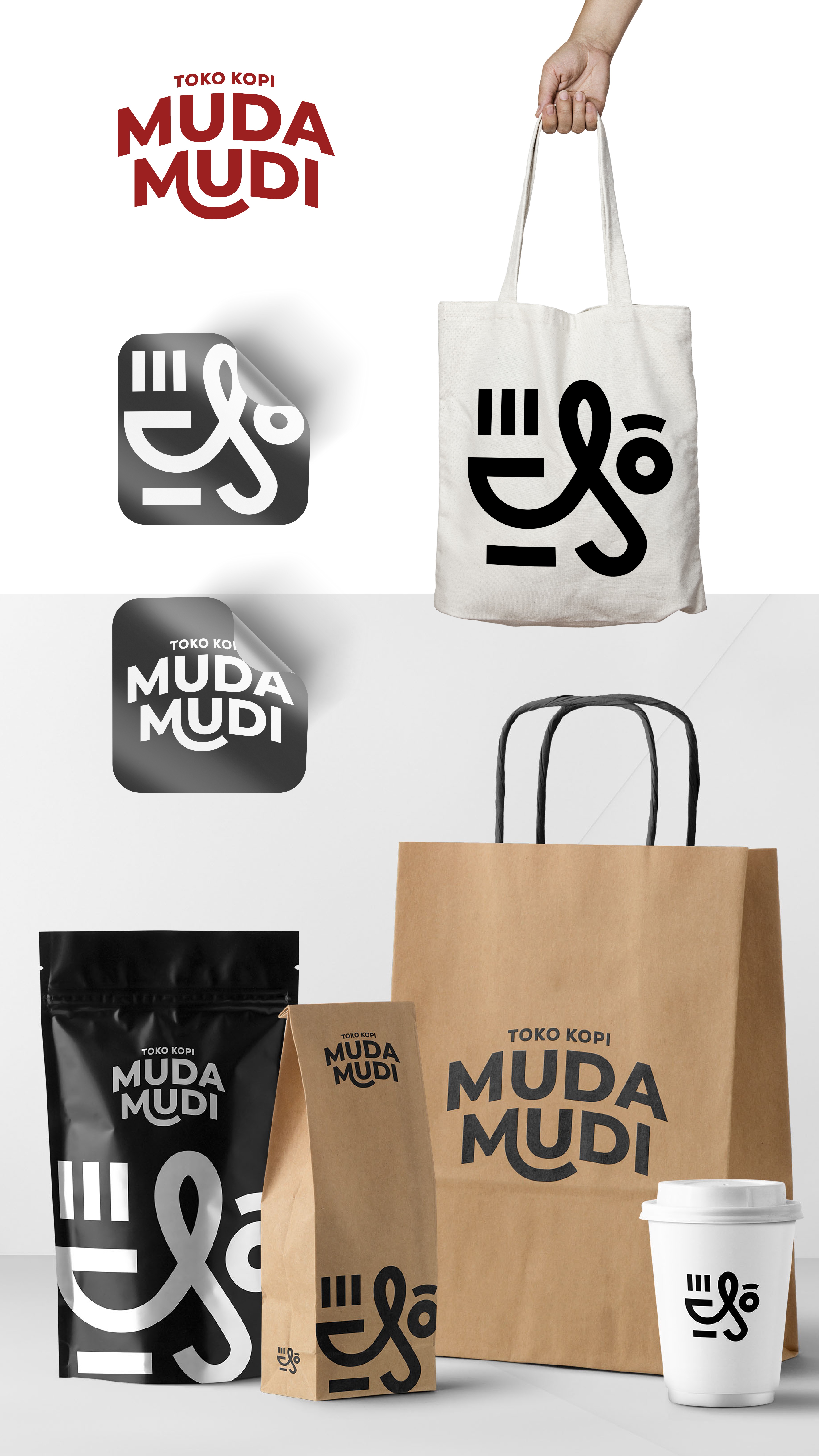

the main logo which has a combined visual concept of a cup as a symbol of warmth and face as well as the shape of the letter M forming a smile which is presented as a comfortable description of the atmosphere in a "toko kopi muda mudi". The flexibility of the lines that form objects means that "toko kopi muda mudi" exists as a coffee shop that is flexible and easy to reach in terms of location and "waktu"