Logo Concept for True Power

3
Creati su 99designs di Vista
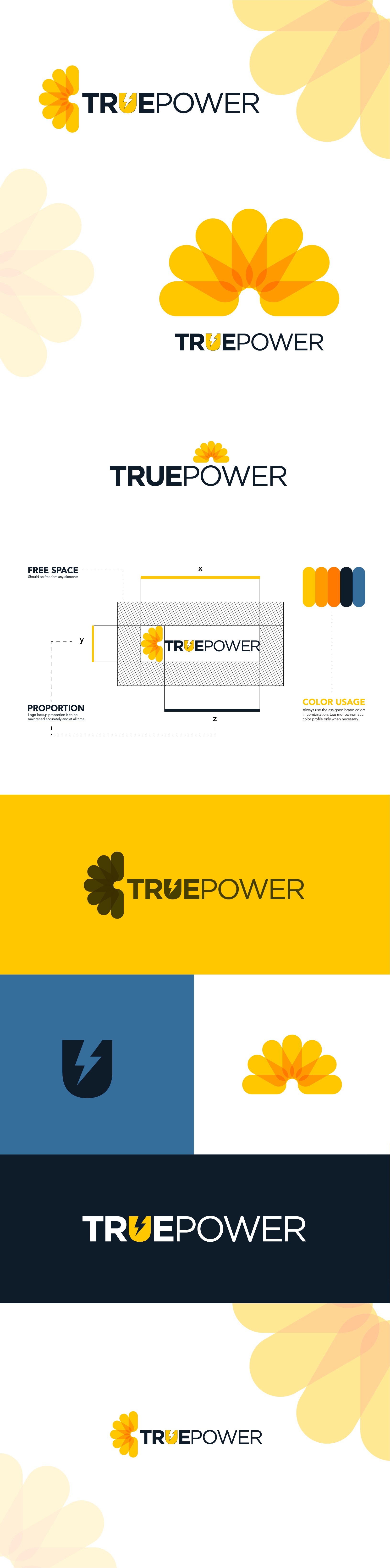
Since everyone is going for the same visual direction, I took the liberty to present a unique and fresh perspective for True Power. Let me illustrate the idea behind the direction.
1. This is a company that helps homeowners take advantage of the sun by switching them to solar as their energy provider. In order to achieve that, the logo needs to be memorable and easy to look at (Legible).
2. The primary emphasis is on a typography-based logo system.
Here, I'm providing 4 different logo lockup systems to help you grab the desired attention of the ideal audience and keep them on the hook for more.