Clickoo - Data-Analytics Re-Branding

1
Creati su 99designs di Vista
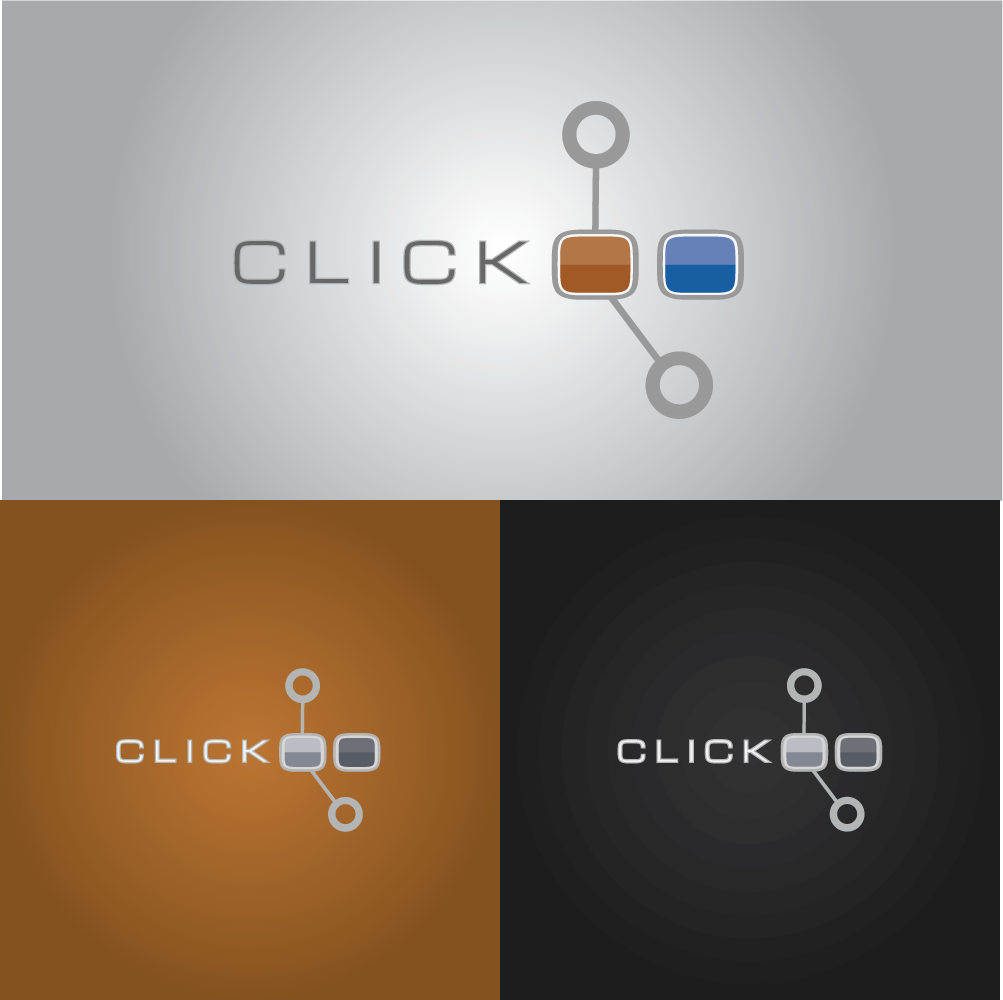
The purpose of this logo is to provide the client with a re-branding that encompasses modern technology with their vision for marketing.
The dots represent repeated data points, while the connecting lines represent analytics between these points.
This "satellite" structure of dots and lines can later be used to create a seamless pattern that will resemble a "circuit board" or "mesh fence" or series of "1's and 0's."
Finally, the typography used for the company name is thin and balanced with clean edges to reflect current trends of modern minimalism and simplicity.