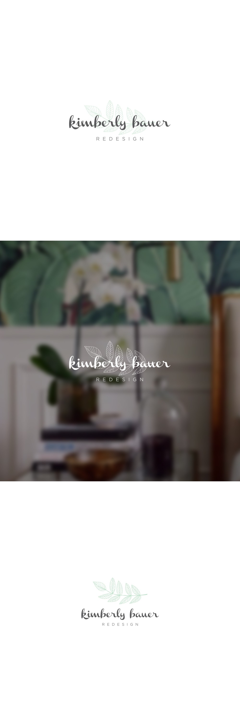

This logo was created for Kimberly Bauer, a redesign and home décor consultant. The concept was to blend the natural essence of interior revitalization with a soft, calming aesthetic. The hand-drawn leaf element symbolizes organic growth and transformation core values of the brand.
The typography was chosen for its approachable elegance, pairing a friendly script with a clean sans-serif to balance creativity and professionalism. The overall composition conveys both warmth and refinement, ideal for a service rooted in home and lifestyle.
Designed for both digital and print, this logo maintains clarity and harmony across multiple applications from website headers to business cards. Its light, airy feel resonates well with audiences seeking fresh, stylish, and sustainable design solutions.