Concept Logo for I. Magnin Building

0
Creati su 99designs di Vista
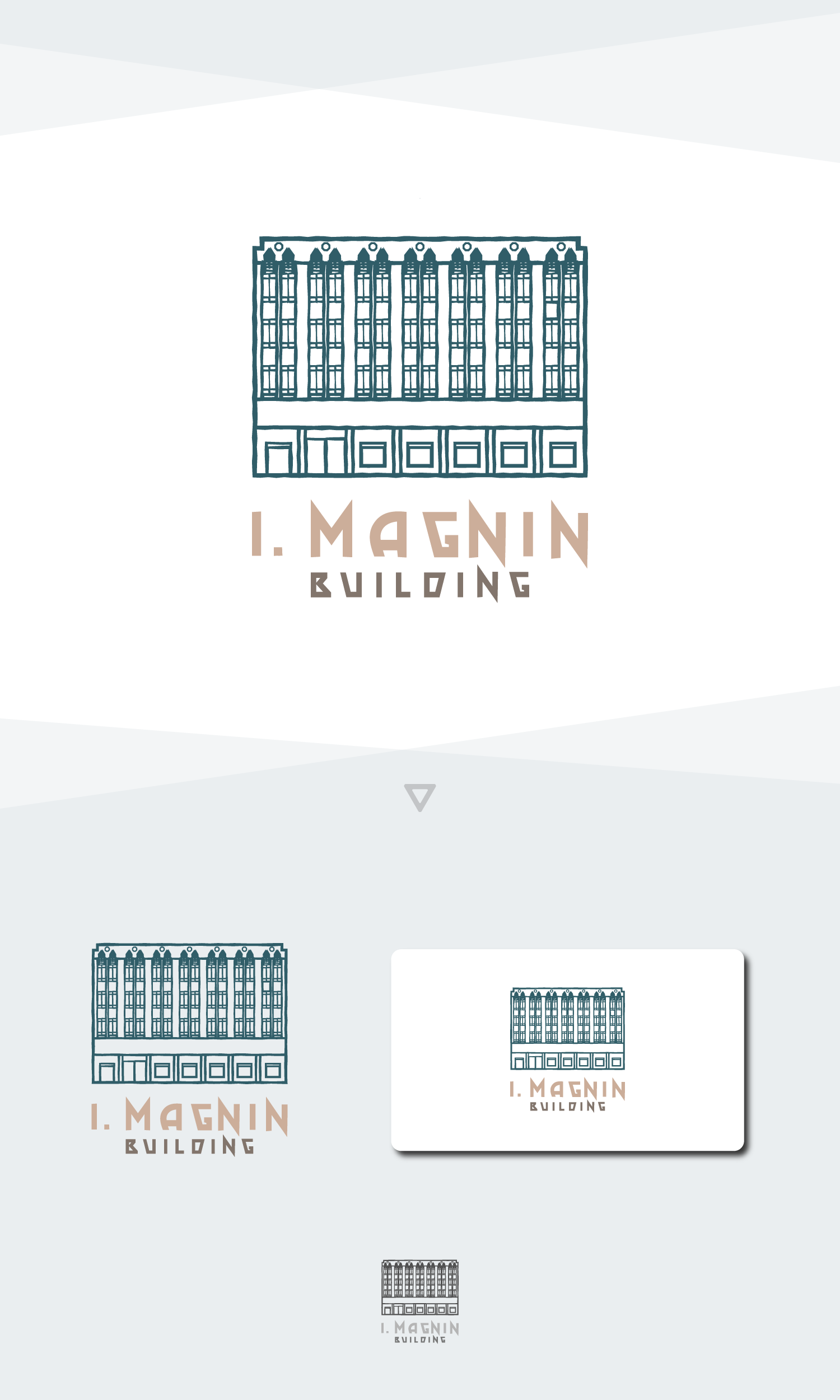
I. Magnin is a building re-constructed for rental space use.
My approach is to design a logo that is functional as well as elegant. Since what the company is selling are rental spaces in the building, I decided to draw a line art of the building itself so that any client that comes in contact with the logo be reminded of the building itself, making it easier for them to recognize what building the brand represent.
The wordmark is made similar in style to the current wordmark name board in front and inside of the building. The line art uses a green color similar to the oxidized copper green color of the outside of the building.