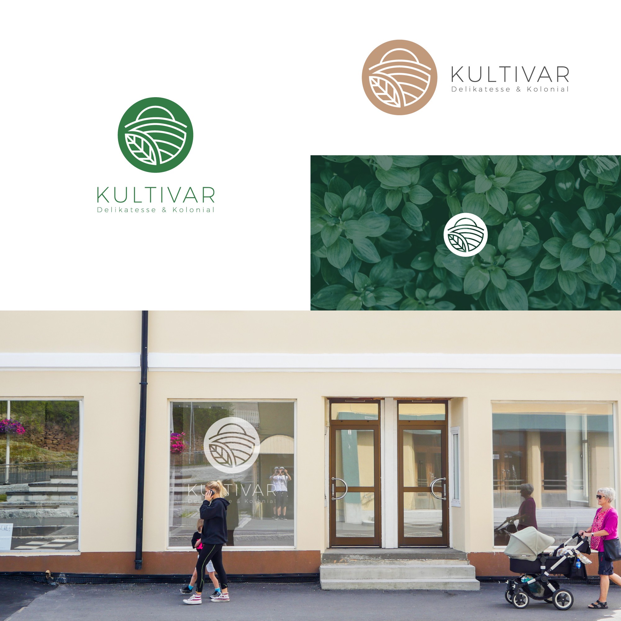
Logo concept for an organic food store

0
Creati su 99designs di Vista
The idea behind my design was to incorporate natures symbols to create the organic feel.
For me the best way to represent that was creating more understandable symbols so people would
immediately know what kind of product you are selling.
The symbols I’ve chosen were: a leaf, a plantation and above all the Sun which I wanted to also represent a farmers hat to get that farmy vibe and I’ve picked two colors that could be used for the logo, the darker green which represents the plants and beige skin color.