Create a strong and trustworth LOGO for an agribusiness company / Crie uma LOGO forte e de confiança para empresa rural
0
Creati su 99designs di Vista
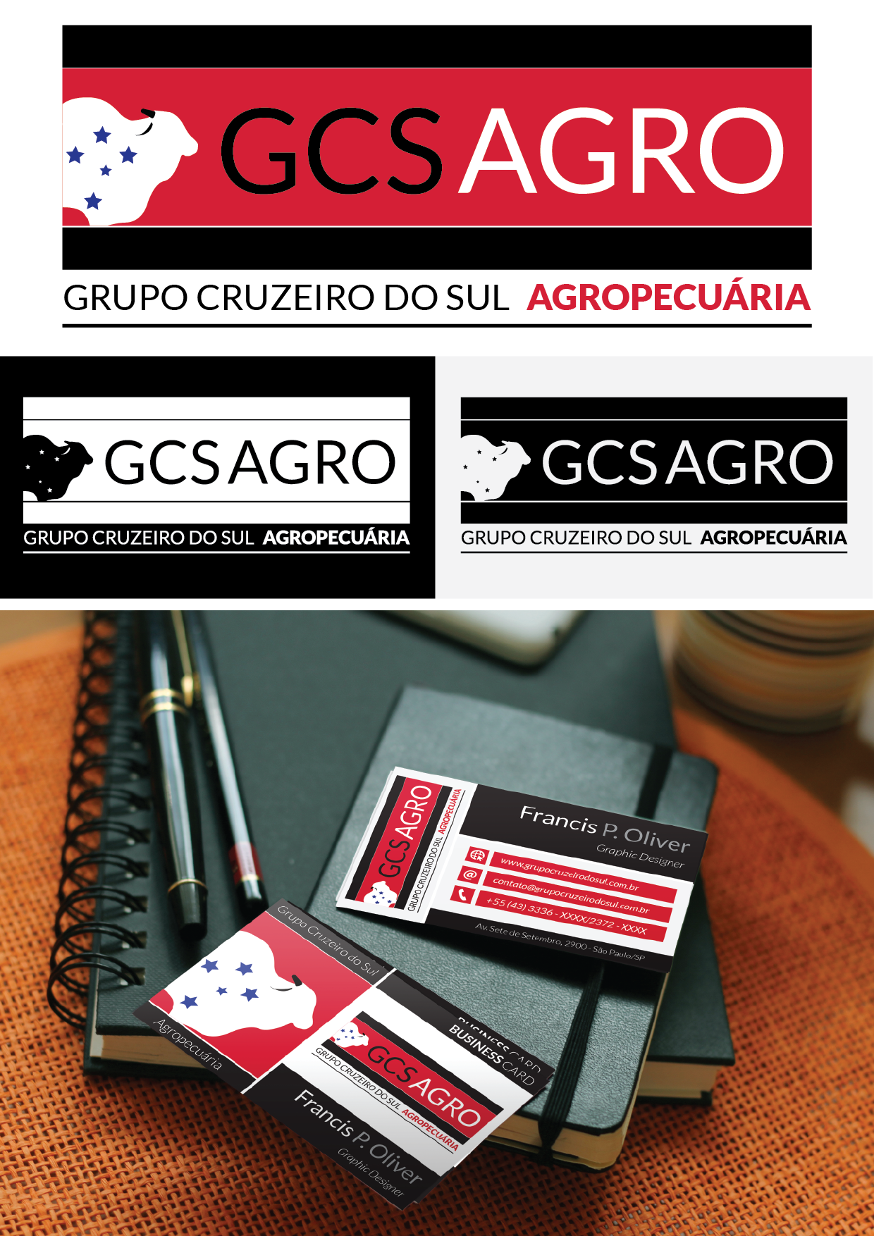
As I wrote in the first proposal , I kept the Southern Cross the requested by the client and try to avoid the " obvious ".
In this version I used red tone to give strength to the brand.
The black color refer to the luxurious and something " solid".
